Concept: transparency as a spatial strategy
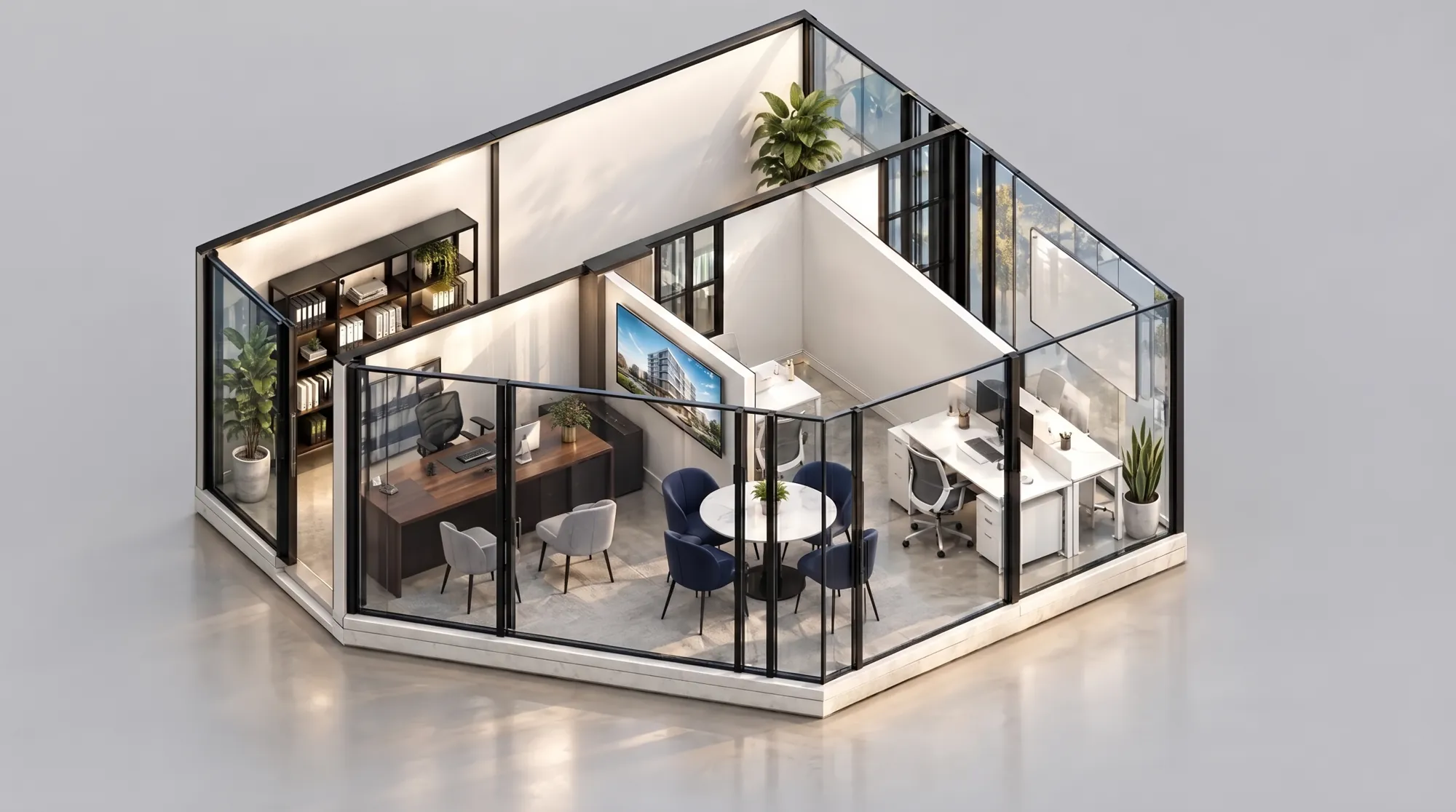
The starting point was to avoid the typical office of closed doors and corridors. Instead, the plan is treated as a single open volume, subdivided only by glazed partitions in slim black steel frames.
The glass works on two levels. Functionally, it separates uses and gives each zone acoustic and visual privacy. Symbolically, it makes the work visible: from the entrance, the client reads the whole office in one glance and understands how it is organized. Nothing is hidden.
Zoning and spatial sequence
The program is organized as a gradient from public to private. The client enters directly into the advisory area, the heart of the plan. The open workstations sit along the glazed façade, and the director’s office occupies the most protected corner, at the end of the sequence.
This hierarchy means that circulation is short and intuitive. Every zone is reached without corridors, and the visual connection between spaces lets the team support each other during the day.
The advisory area: a round table
The meeting point between advisor and client is a round table, placed at the center of the plan. A round table has no head and no “other side”: advisor and client sit next to each other and review documents together. It is a small architectural decision that changes the tone of the conversation, from a transaction to an accompaniment.
A wall-mounted screen on the solid partition facing the table supports presentations, and its position keeps the glass lines clean and uninterrupted.
“A space can earn a client’s trust before anyone says a word.”
Light and the framed glass
Daylight enters through the exterior glazing and, thanks to the glass partitions, it is borrowed by the interior rooms. Even the private office and the advisory area receive natural light, which reduces the need for artificial light during the day and makes a compact office feel larger.
The rhythm of the black mullions gives the space structure. They draw a precise grid against the white walls and work as a quiet modulation, similar to the order of a façade, but at the scale of the interior.
Materiality and detailing
The palette is deliberately restrained: white walls, a light polished floor, black steel profiles and warm wood in the director’s desk and the full-height library. Navy upholstery introduces a single confident accent tied to the identity of the brand.
Plants are integrated into each zone as part of the composition, softening the geometry of the glass and bringing a biophilic layer that improves the wellbeing of the people who work there every day.
From the render to the built space
I developed the project from concept to construction. The 3D renders allowed the client to approve the atmosphere before building, the construction drawings resolved the partition layout, the joinery and the finishes, and the site supervision ensured that the lines and proportions of the design were built as intended.